Encapsulating UI: How to Build a Custom Toast with Web Components
What are web Components?
Web components are a way for developers to create custom elements ( kind of like how components in react are). It is a set of web platform APIs that allows us developers to create encapsulated and reusable html components.
Well these are pretty interesting and I'm going to use web components to create a custom toast 🍞 element. So let's dive in.
Implementation
Goal: To create a custom toast element , which is reusable
A great thing about creating a web component is we don't need any 3rd party libraries, just plain old javascript :)
The 3 main building blocks of a web component are:
- custom element
- shadow DOM
- HTML template
Let's start by creating a custom element for the toast component. Custom elements allow me to define my own HTML tags.
class FrenchToast extends HTMLElement {
    constructor() {
        super();
        this.innerHTML = `<h3>French Toast</h3>`
    }
}

window.customElements.define('french-toast',FrenchToast)
I have named my custom toast element as <french-toast> ( I couldn't come up with a better name :') sadly) and this custom element is displaying a text in a <h3> tag.
Using this element in our HTML code is the same as how we use other elements.
<!DOCTYPE html>
...
<body>
    <french-toast></french-toast>
    <script src="./frenchToast.js"></script>
</body>
Now since we have set up a basic custom element, let's add some code to make it an actual toast message.For this the shadow-dom and html-template will be useful.
shadow-dom is a way to encapsulate the internal structure and styles of a web component.This avoids CSS conflicts and allows components to be styled independently.
HTML templates allow me to define reusable markup that can be cloned and used inside web components.
The template I have created contains a div for the toast message and a placeholder for showing an icon based on the type/category of the toast message which could be any one of the below categories:
- success
- warning
- error
- default
Now, a toast message has to disappear after sometime, so to acheive this I made use of the setTimeOut and the attributeChangedCallback lifecycle event of a web component. This allows me to listen for any attribute value change in the custom element.
attributeChangedCallback(name, oldValue, newValue) {
        if (name === 'open' && newValue == 'true') {
                this.showToast();
        }

        if (name === 'placement' && oldValue !== newValue) {
            this.placement = this.getAttribute('placement')
            this.setPlacement();
        }

        if (name === 'type' && oldValue !== newValue) {
            this.toastType = this.getAttribute('type')
            this.setBackgroundColor();
        }

        if (name === 'duration' && oldValue !== newValue) {
            this.dismissDuration = newValue;
        }

    }
Also the duration, position and the category type of the custom toast element can easily be set as an HTML attribute.
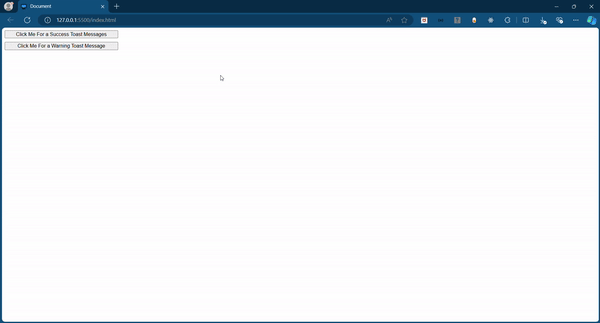
    <french-toast id="toast-msg-1" duration="2000" open="false" placement="top right" type="success">
        This is a success toast message
    </french-toast>

    <french-toast id="toast-msg-2" duration="2000" open="false" placement="bottom center" type="warning">
        This is an warning toast message
    </french-toast>
I have got two toast messages one is placed at top right and another one at bottom center with a duration of 2 seconds.
Final Thoughts
Using web components to build custom UI elements gives you full control over their behavior and appearance, without the need for external libraries. This encapsulation also prevents styles and functionality from leaking into other parts of your application, making components more modular and reusable.
This toast component is just the beginning—feel free to check out my Github Repository for the complete code!
Cheers! 😁